Mobile SEO is the practice of optimizing a website for mobile users so it loads quickly, displays correctly, and ranks well in mobile-first search results. Since Google prioritizes mobile versions of websites for indexing and ranking, strong mobile SEO helps brands improve visibility, user experience, and conversions across both mobile and desktop search.
Summary
Mobile Search Engine Optimization (SEO) plays a critical role in how websites rank, perform, and convert in today’s mobile-first search environment. As most searches now happen on smartphones, brands must ensure their sites are fast, responsive, crawlable, and easy to use on mobile devices. This blog explains what mobile SEO is, why it matters, and how to implement mobile-friendly best practices that improve rankings, user experience, and lead generation.
Table of contents
What is mobile SEO?
Mobile SEO is the process of optimizing your website for customers who access your site from their mobile devices. The goal is to make your website accessible and mobile-friendly. With a mobile-friendly website, you’ll create a positive experience for your customers, rank higher on search engines like Google, and attract more leads.
Mobile SEO tends to consider things like:
- Outstanding user experience on your website
- How fast your pages load on mobile
- How people tend to use search on mobile vs. desktop
- Your web pages are “crawlable” by Google bots
Why is mobile SEO important?
As of May 2022, 58.26% of all web traffic came from mobile – which means most of your customers are finding and visiting your website on their smartphones. If you don’t have your site optimized for mobile SEO, you’re more likely to miss leads and even lose those visiting your site if it doesn’t provide an optimal user experience.
Similar to desktop optimization, the technical SEO aspects like making sure your site is bot friendly are still very important in mobile SEO. However, understanding how customers use search engines also becomes much more important. The same search query on desktop and mobile can provide different results, so knowing what your customers are looking for when searching on mobile can provide a big advantage.
For example, if you search “Mount Rushmore” on desktop and mobile, you’ll see two different sets of results.
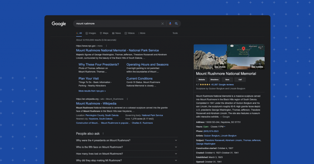
The desktop search engine results page is very informational, directing users to useful sites and answering questions about the monument.
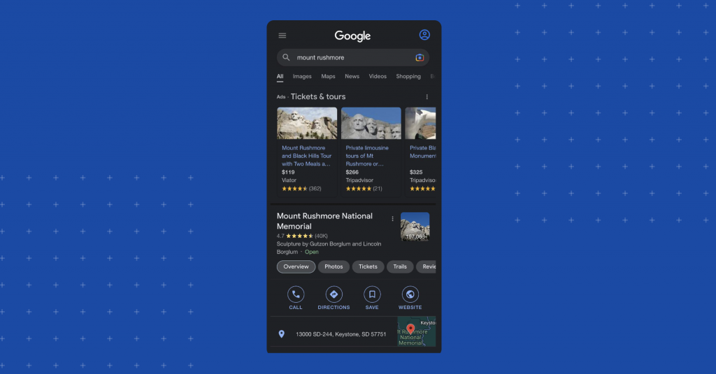
However, the mobile search engine results page is focused more on providing the user with tickets, tours, and directions to the monument. Knowing the potential search results that will appear for a user on mobile is very important if you want to understand your customers’ intentions when searching for a product or service on their smartphones instead of desktop.
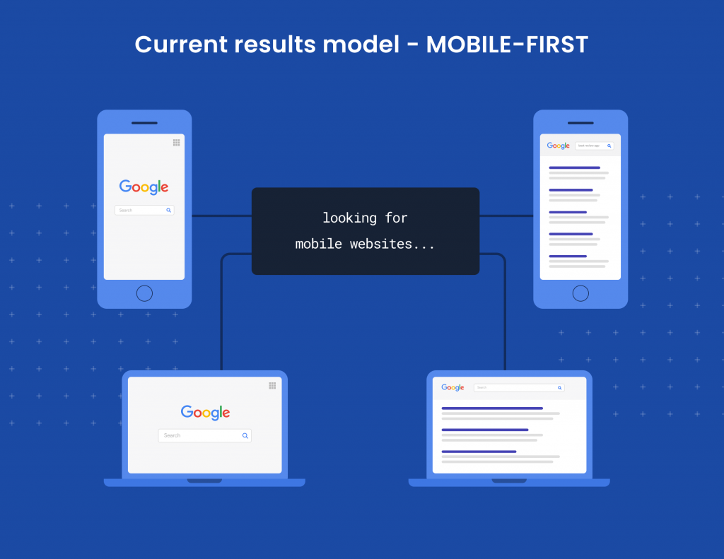
What is Google’s mobile-first index?
In the past,Google would rank search results from their index depending on whether you searched from a mobile device or your desktop. In other words, if you searched on mobile, you’d only see mobile results, and if you searched on desktop, you’d see only desktop results. This model worked well before smartphones dominated search.
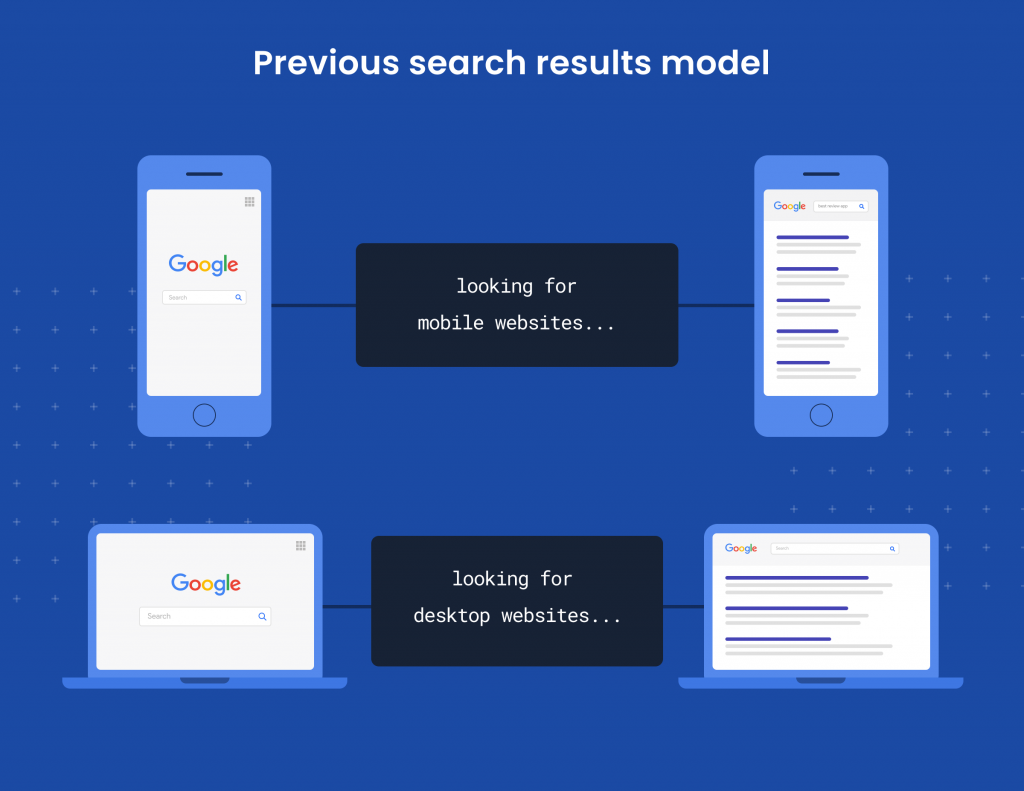
But things changed once the majority of online searches were done via mobile. With Google’s mobile-first index, no matter if you search from mobile or desktop, you will see results based solely on how Google ranks mobile search results. So, whatever ranks best on mobile, those are the results you’re going to see whenever you conduct a search.
If you’ve already optimized your site for mobile, you shouldn’t see any negative impact on your site traffic. But if you haven’t optimized for mobile, you could see dips in your traffic and rankings. To avoid this, you need to make sure your site loads quickly, all of your links and redirects are working properly, and all your page resources load correctly, among other important mobile SEO criteria.
How to implement a mobile-friendly website
When it comes to creating your website and making sure that it’s mobile-friendly, there are a few rules to follow:
Don’t use separate URLs
In the early days of mobile site development, using multiple URLs was common. You would take your standard URL, like www.birdeye.com, and use an m-dot version like m.birdeye.com. When a user searched for the site, the website would determine if they were searching from desktop or mobile. The website would then provide the user with either the standard URL or the m-dot version.
However, this isn’t a recommended way to create a mobile-friendly site because you would have to create and maintain content for two different versions of your website. This is so cumbersome that even Google doesn’t recommend this option.
Don’t use dynamic serving
With dynamic serving, you can keep all your content under the same URL, but the HTML and code will work differently for mobile and desktop. Different Google bots crawl your website specifically for mobile and desktop. So, the server will request a user agent for mobile or desktop based on the different HTML and code mobile and desktop versions of your site.
This configuration is also not recommended by Google because it’s still difficult to maintain different versions of code, even if they share the same URL.
Do use responsive design
Responsive design is the most recommended way to optimize your site because it keeps your URL and code intact on desktop or mobile. This configuration is “responsive” because it responds directly to each user and adjusts to the screen size of their device.
Google recommends a responsive design configuration for several reasons, including improved website load time without redirects, improved SEO due to more efficient site crawling, and enhanced user experience.
How to check if your website is mobile optimized
Once you have your site configuration set up, you need to make sure that your pages are optimized for mobile SEO.
Use Google’s Mobile-Friendly Test
There are several great SEO tools you can use to check your website performance for mobile friendliness. For example, Google’s Mobile-Friendly Test lets you plug in your URL to see where your site is performing well and where you’re having errors that could hurt your mobile friendliness.
Use the Mobile Usability Report
Another great tool is the Mobile Usability Report in Google Search Console. Just by plugging in your URL, you can get a detailed report on all the mobile SEO errors that are happening on your website so you can take action to fix them. You can even click on each error and get tips and tricks directly from Google on how to fix them and improve your website for mobile.
Use a browser simulator
A big part of mobile SEO is understanding and optimizing content for user experience. If you want to see how your customers will see your pages on their mobile devices, you can use a browser simulator. You can also simulate your pages on browsers like Safari, Google, and Bing.
Mobile SEO best practices
Make sure your site is “crawlable”
If you want to get your site to rank, Google needs to be able to crawl it and index it, or put it in their database. You can do things to make sure you’re not blocking Google from crawling the site that you never knew you were doing in the first place.
A useful tool you can use to start is the URL inspection tool. When you run your website through this tool, you will get a report with all the crawling issues on your pages. You can also click on each error and get tips and suggestions similar to the Mobile Usability Report.
You can then make sure you’re not accidentally blocking Google bots from crawling your pages by checking your robots.txt file. To do this, all you have to do is type in your website’s URL followed by /robots.txt. When you do this, you’ll be able to see if any pages are blocked from Google bots with a “disallow” directive and make sure none of them are blocked.
Keep content the same from desktop to mobile
A common misconception is that Google has two indexes, one for desktop and one for mobile. But Google only has one index, and because it prioritizes mobile-first, you need to make sure that you’ve optimized your content for mobile and consistent across both platforms. The best way to go about it is to make sure that you have the same content in your HTML and optimize how the page displays on desktop and mobile.
You’ll want to check your website and make sure all of your text, pictures, headers, meta descriptions, captions, etc., appear the same for your customers whether they’re visiting your site from their smartphones or desktop computers. And if you’re still using separate URLs for your mobile and desktop pages, make sure you shift to a responsive design as quickly as possible to improve your ranking.
Improve your website speed
How long do you think your customers will wait for your page to load? The answer isn’t as long as you think. In a very short time, your customers will leave or “bounce” from your site before they ever see what’s on the page if the load time is too long.
Google’s research has found that even if your pages’ load times go from just one to three seconds, your bounce rate will increase by 32%. Worse yet, if it takes up to 10 seconds to load, your bounce rate skyrockets to 123%. Google prioritizes customer experience, so if your pages take too long to load, you’ll have difficulty ranking on their search results.
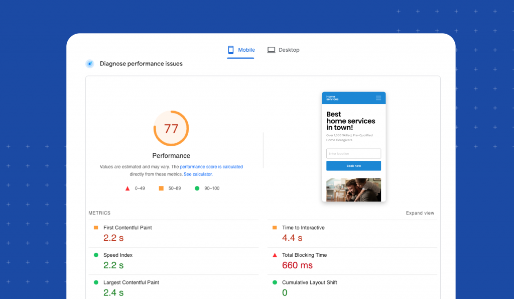
A useful tool you can use to measure your page speed is Google’s PageSpeed Insights tool. When you enter your website into the tool, it will give you a detailed report showing you an overall score of your page speed performance and breaks it down into detailed metrics that you can focus on when improving your page speed.
Make the user experience flawless
It’s easy to forget that your customers are the end-game in all of your mobile SEO optimization. You want to make sure that the experience they have when visiting your site is excellent, so they’ll stay on your site and come back for more. Here are some things you can do to optimize for user experience.
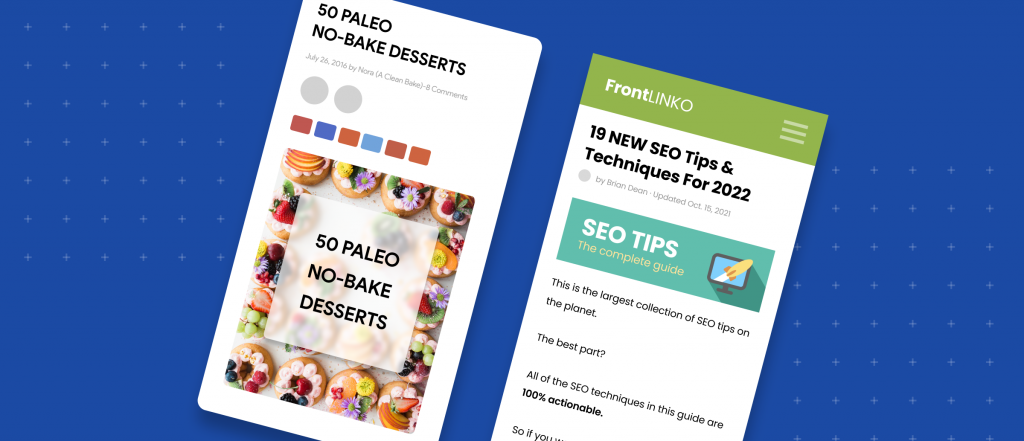
Make your content easy to read
One of the first things that can turn a customer away from your site is an inability to read the information. Small print, hard-to-read font, and blurry images will make your customers bounce quickly and likely never return. You can avoid this by doing a few things:
- Use a large enough font. Anything below 14pt font is likely to be too small for your readers. Stick to something bigger.
- Don’t use bulky paragraphs. Most readers will turn away from long paragraphs. Use one or two lines per paragraph to make sure you don’t bore your readers.
- Have plenty of on-screen contrast. It’s hard to read text when the background color is similar or doesn’t provide enough contrast. Make sure your background colors contrast well against your text for easy reading.
Use small header images
Google knows if the images on your pages get in the way of your visitors getting the information they need right away. So, don’t use header images that are so big it takes time to scroll past them. Use short, appealing images at the top of your page to draw your readers in while giving them the info they’re looking for right away.
Make navigation easy
When your customers visit your site, they need to be able to navigate as easily as they do on desktop. If you group all your images, text, buttons, and hyperlinks tightly together, it will be hard for them to navigate on their mobile device. Make sure you provide enough negative space so they won’t accidentally click on one part of your page when they meant to click the button next to it.
FAQs about mobile SEO
Birdeye strengthens mobile SEO by ensuring business information is accurate across listings, generating mobile-friendly reviews that influence search visibility, and providing insights into how customers discover locations across search, maps, and AI-powered platforms.
Mobile search prioritizes fast access to accurate information and trust signals. Birdeye Listings AI keeps location data consistent across directories, while Reviews AI builds credibility that influences mobile rankings and click-through decisions.
Yes. Birdeye Search AI analyzes how locations appear in AI-generated answers across platforms like ChatGPT and Gemini, highlighting citation gaps, accuracy issues, and data sources that influence mobile and AI-driven discovery.
Birdeye centralizes listings, reviews, analytics, and competitive insights in one platform, allowing teams to manage mobile search visibility across hundreds or thousands of locations without manual effort.
Birdeye: Strengthening mobile SEO for multi-location brands
Mobile SEO goes beyond website design, it depends on accurate listings, fast access to information, and trust signals that influence how users and search engines evaluate your brand. Birdeye is the #1 Agentic Marketing Platform for multi-location brands, helping them improve mobile visibility, engagement, and conversions across search, maps, and emerging AI-powered discovery channels.
With Birdeye, brands can:
- Ensure mobile-ready listings everywhere
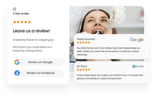
Birdeye Listings AI keeps business information accurate and consistent across Google, Apple Maps, Facebook, and hundreds of directories, critical for mobile search and local rankings. - Build trust with mobile-first reviews
Birdeye Reviews AI automates review generation and responses via SMS and email, helping brands get more reviews on Google and other major platforms, improve sentiment, and influence mobile search decisions. - Understand visibility beyond traditional search
Birdeye Search AI analyzes how locations are surfaced across AI-powered search experiences like ChatGPT, Gemini, Perplexity, and more by analyzing listings data, reviews, and third-party sources. It helps brands identify gaps that may impact both mobile SEO and AI-driven discovery. - Track performance and optimize with AI insights
Birdeye Insights AI and Competitors AI provide visibility into location-level performance, customer behavior, and competitive benchmarks, helping teams prioritize improvements that drive mobile engagement and conversions.
By combining mobile-friendly web experiences with strong listings, reviews, and AI-driven insights, Birdeye helps brands turn mobile search traffic into real business results.
Click the banner below to find out how Birdeye can help.

About the Author
Birdeye Staff Writer
Originally published


![[Feature image] The Best Marketing Platforms for Multi-Location Brands](https://birdeye.com/blog/wp-content/uploads/Feature-image-The-Best-Marketing-Platforms-for-Multi-Location-Brands-375x195.png)